Résumé Design

Welcome to the Purdue OWL
This page is brought to you by the OWL at Purdue University. When printing this page, you must include the entire legal notice.
Copyright ©1995-2018 by The Writing Lab & The OWL at Purdue and Purdue University. All rights reserved. This material may not be published, reproduced, broadcast, rewritten, or redistributed without permission. Use of this site constitutes acceptance of our terms and conditions of fair use.
This handout offers advice for making informed design choices in creating a résumé. We also have a sample résumé that uses these design principles available in the media section above.
Why is the design of my resume so important?
Employers will usually take, at most, only thirty-five seconds to look at this one-page representation of yourself before deciding whether to keep or discard it. To ensure that you will make it past that initial screening, you should design your résumé in such a way that employers can read the document easily and process information quickly. One way to do this is to conform to the conventional format of a résumé, since employers know how resumes work and where to locate certain information. In addition, you should keep certain design principles in mind that will increase your chances of getting your résumé into the "keep" pile. Designing your résumé can be a challenge and requires you to take a closer look at how readers read. Here are some tips to help you make your résumé a winning experience.
The quadrant test
Readers typically read from left to right and from top to bottom when information is "balanced" (about an equal amount of text and white space) on the page. Being able to anticipate the reader's response to a résumé in this way will allow you to manipulate information according to the quadrant test. First, divide your résumé into four quadrants, as seen in the example below.
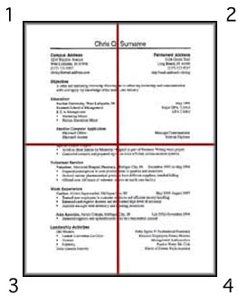
Résumé split into quadrants.
Each one of your quadrants should have an equal amount of text and white space (empty space where there is no text). When your page is balanced, the reader will typically read anything in quadrant 1 first. So, you should put your most important information—anything you want the employer to see first—in this quadrant.
Using columns to lay out your résumé
One way to create a balanced page is by using columns to format your text. However, keep in mind that since employers spend so little time reading a résumé, you want them to read through it with few stops. The reader's eye will stop when it reaches the end of each column. Although you might want to use columns to create a balanced page, you wouldn't want your reader to have to make too many stops and miss important information.Therefore, you should use no more than three columns on your résumé. Remember that the first place your reader looks at will be located in quadrants 1 and 2, so the most important information should go here. Also keep in mind that when indenting information you might create extra columns, so be aware of your column count.
Here is an example of a résumé section with three distinct columns. The first example has the columns marked in red so that you can see their placement.
| Purdue University B.A Professional Writing |
W. Lafayette, IN | Graduation: 12/99 |
| Purdue University B.A Professional Writing |
W. Lafayette, IN | Graduation: 12/99 |
To create columns of text, you can use the table function in Microsoft Word to create vertical and horizontal placements for your information.
Serif and sans-serif fonts
By manipulating the fonts used in your résumé, you can easily create a hierarchy of information. In general, fonts are divided into two categories: serif and sans-serif. Serifs are the short stems on the ends of the strokes of a letter, as in T of the Times New Roman font. Sans-serif fonts are fonts without stems—sans means without. Here are some examples of the two kinds of fonts.
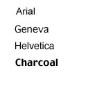
San serif fonts.
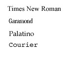
Serif fonts
How you use these two font types depends upon how you want your reader to read certain sections of your résumé. American audiences are used to reading serif fonts, so these fonts tend to keep the eye reading along the text. sans-serif fonts, on the other hand, make the eye stop. Therefore, sans-serif fonts are typically used for headings and titles, allowing the reader to quickly locate information, while serif fonts are used for descriptions.
The key to using fonts in your résumé is to be consistent. For example, if you decide to use a sans-serif font for a main heading, do so for all your headings, and use the same sans-serif font each time. Generally, you should use no more than two fonts in your résumé. Remember that you want to keep the reader reading; you do not want to create too many "tricks" for the reader's eye.
Other types of emphasis
By using more than one font type in a way that is consistent throughout your résumé (using, for example, a sans serif font for all headings, and a serif font for all text), you create emphasis. Another way to create emphasis is by using bold, CAPITALIZATION, italics, and underlining. Your choice for emphasis depends upon your personal taste. However, you should not mix methods, nor overuse them. You would not, for example, want to CAPITALIZE, ITALICIZE, AND UNDERLINE pieces of text; doing so would only make the text less visually pleasing for the reader. In addition, overusing these tools makes the reader ignore the items you wish to emphasize, thus limiting effectiveness. So, be sure to carefully choose which information should be emphasized.
The 20-second Test
How do you know when you have successfully created an easily read résumé that allows employers to process information quickly? Try having someone perform the 20-second test on your résumé. Simply time your reader for twenty seconds as he or she reads your résumé. What all did he or she learn about you? If your reader noticed within twenty seconds what you want employers to learn about you, then most likely you have created an effective résumé. If not, try moving important information to the first quadrant, checking that you have used sans serif and serif fonts consistently, and limiting the tools for emphasis you use in your document.
Job seekers at Purdue University may find value in the Purdue career Wiki.
For more information about how to develop a résumé, visit these OWL resources: