Statistics and Visuals

Welcome to the Purdue OWL
This page is brought to you by the OWL at Purdue University. When printing this page, you must include the entire legal notice.
Copyright ©1995-2018 by The Writing Lab & The OWL at Purdue and Purdue University. All rights reserved. This material may not be published, reproduced, broadcast, rewritten, or redistributed without permission. Use of this site constitutes acceptance of our terms and conditions of fair use.
Tables
Don't be afraid to use graphics. Statistics can contain a lot of information. Visuals can display a lot of information in a manner that can be quickly understood. The same thing applies to tables. For example:
It' s hard to read! Imagine trying to make sense of this. Instead, provide your data in a table for easy reading:
| Group A | Group B | Group C | Group D | |
| Mean | 10.5 | 12.3 | 15.9 | 21.3 |
| S.D. | 2.1 | 1.2 | 1.8 | 2.5 |
A table is much easier to read than blocks of text. It can help sort the information for both you and your readers. It also makes group comparisons easy. For example, suppose you want to point out to the reader the difference between group A and group D (perhaps this was a new weight training program comparing the number of 80 lbs. dumbbell reps).
| Group A | Group B | Group C | Group D | |
| Mean | 10.5 | 12.3 | 15.9 | 21.3 |
| S.D. | 2.1 | 1.2 | 1.8 | 2.5 |
Or, you could do this:
| Group A | Group B | Group C | Group D | |
| Mean | 10.5 * | 12.3 | 15.9 | 21.3 * |
| S.D. | 2.1 | 1.2 | 1.8 | 2.5 |
Don't be afraid to bold, use asterisks, or otherwise highlight important groups or comparisons.
Graphs
Graphs are an excellent alternative to tables, and they are used by virtually everyone in every field. Papers and articles are like faces. Graphics are like makeup. Makeup is always good in small doses, but don't over apply, or you will end up looking worse than if you didn't use any make up at all. Use visuals, but be careful not to over use them. This is a good example of a visual using the data from the previous table:
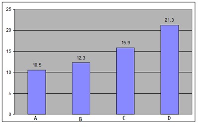
Visual Graph of Data
Consider distributions of information for a moment. Imagine that we are teaching a class and displaying the students' first homework grades to the students for their benefit. This is one of the ways we could display their homework grades.
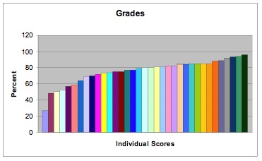
Poor example of a graph.
In this graph, each of these bars represents a student (each student gets a different color). This is an example of using too much make-up. While the graph does convey a lot of information, it is hard to read. The following graph is much better, and it actually gives you some useful information regarding the class:
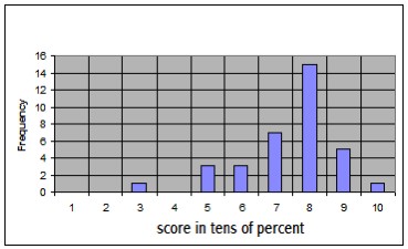
Better graph of student scores
Now we can clearly see that one person did really poorly, but that most people were clustered between 70-90%. In the first graph of student scores, we can't really 'see' the distribution, but in this second graph we have a much clearer image of the distribution of scores.