Résumé Design Part 2

Welcome to the Purdue OWL
This page is brought to you by the OWL at Purdue University. When printing this page, you must include the entire legal notice.
Copyright ©1995-2018 by The Writing Lab & The OWL at Purdue and Purdue University. All rights reserved. This material may not be published, reproduced, broadcast, rewritten, or redistributed without permission. Use of this site constitutes acceptance of our terms and conditions of fair use.
Using Columns in Your Résumé
Another way to create a balanced résumé is to use columns to format your text. Since you have a limited amount of space on your résumé page, do not use more than three columns. Here is an example of how to use columns to save space in your résumé for the summary of qualifications:
| Skills in | Ability to | Knowledge of |
| Welding steel, aluminum, stainless steel Hand and power tools Physical dexterity and ability to lift over 100 pounds |
Diagnose problems and determine appropriate action Work in high-stress situations Perform basic mathematics Read blueprints and work orders Write materials requests, records |
Mechanical systems, fabrications, and welding Welding theory and principles Welding tools and welding codes Safety procedures |
To create columns of text, use the Insert Table function in Microsoft Word.
Résumé Fonts
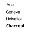
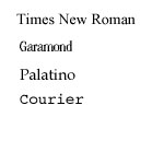
In order to make your résumé easy to read, you should use fonts to separate information. However, you do not want to make your résumé messy or too “busy” by using more than two kinds of fonts and font sizes. Also, you do not want to use fonts that are not professional. A good way to mix fonts is to use serif and sans-serif fonts. Serifs are the short stems on the ends of the letters. Times New Roman is a serif font, while Arial is a sans-serif font. You can see the difference between some fonts in the image below:
| Sans Serif Fonts | Serif Fonts |
 |
 |
An effective mix of Times New Roman and Arial is to use Arial in the contact information section of your résumé and as the headings: Objective, Education, etc. Then you can use Times New Roman as the body text. Remember to be consistent, however, with your fonts. The sample résumés included with this resource shows examples of using Arial and Times New Roman together.
Other Types of Emphasis
In addition to using a good balance of text and white space and a good mix of fonts, you can use other types of emphasis in your résumé. You may also bold or italicize your text. Be careful not to mix too many types of emphasis, however. If you bold, and italicize, and ALL CAP, and UNDERLINE WORDS, you make them more difficult to read rather than making them clearer: Work Experience.
Click here to download the PDF file containing sample résumés and employment letters.