Visual Rhetoric: Text Elements

Welcome to the Purdue OWL
This page is brought to you by the OWL at Purdue University. When printing this page, you must include the entire legal notice.
Copyright ©1995-2018 by The Writing Lab & The OWL at Purdue and Purdue University. All rights reserved. This material may not be published, reproduced, broadcast, rewritten, or redistributed without permission. Use of this site constitutes acceptance of our terms and conditions of fair use.
Text is so obviously visual that its visual nature and power is often invisible. While it might be interesting to look at the history of typography, or the way type has been transformed by computers, what we really need to do is think about what type does. Let's consider a few examples using some words that are probably unfamiliar to you (Lorem Ipsum) so that you can better "see" the type without considering the actual meaning of the words (though we'll talk later about why meaning and visual should and cannot be separated).
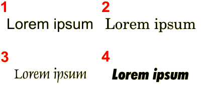
Lorem Ipsum Text Placeholder
Even with just these four type faces, we can see different personalities (however limited), levels of formality, and even hints of the rhetorical concept ethos emerging (one's credibility). Novice designers tend to choose fonts not according to their rhetorical situation, but rather to what they think looks pretty, or cool, or whatever. But it's important to think about the kinds of visual/cultural associations that different fonts bring with them. Here are the same four fonts, with text that appears visually/culturally appropriate:
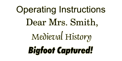
Arial, Century Schoolbook, Dauphin, Futura Xtra Black Condensed Italic
The first two fonts (Arial and Century Schoolbook, respectively) may not jump out at you as having a whole lot of cultural associations; that's partly by design—the fonts are deliberately nondescript (especially Arial), and thus are used quite commonly. Not so with the fonts used for "Medieval History" (Dauphin) and "Bigfoot Captured!" (Futura Xtra Black Condensed Italic). The "Medieval History" text looks like our cultural conception of Medieval script. That is, the font looks almost like it was hand-written. Likewise, we've all seen tabloid papers in the checkout lanes of the supermarket, announcing in bold, loud text all sorts of incredible news.
Let's look again at a negative example, where these cultural codes are ignored:

Arial, Century Schoolbook, Dauphin, Futura Xtra Black Condensed Italic Used Out of Context
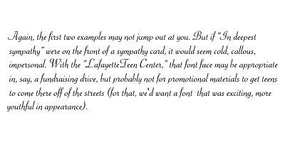
Again, the first two examples may not jump out at you. But if "In deepest sympathy" were on the front of a sympathy card, it would seem cold, callous, impersonal. With the "Lafayette Teen Center," that font face may be appropriate in, say, a fundraising drive, but probably not for promotional materials to get teens to come there off of the streets (for that, we'd want a font that was exciting, more youthful in appearance). The "Chemistry Lab Report" example might seem OK at first glance (it's formal, it evokes a sense of history with the word "chemistry"—though chemistry is a relatively young discipline), but it fails rhetorically because it does not acknowledge the expectations of the general audience of chemists or chemistry instructors. Taken in that light, in fact, the text for "Chemistry Lab Report" looks ridiculous. Likewise with "Museum of Natural History"; we still see the tabloid headline in it, as though "Overtaken by Mutants" were the words we'd expect next!
Headline versus Body Text
Keeping in mind the ideas we've already covered, there is an issue of readability involved in font choices. For example, this script font is fine for the following headline text:
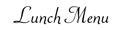
Lunch Menu
However, let's repeat the text from the preceding section in the same font:
Script block text
Now, that font may be OK if that's all the text there is. But can you imagine reading that for five pages? 25? An entire biology textbook? Absolutely not! This is specifically why we have fonts like Times New Roman or Arial (though there are far better choices, in print, than those): they are comfortable to read for quite awhile; we don't have to strain to read the words.
Text and the Web
When novice designers bring some of their bad font-choice habits to the Web, the results can be disastrous.
First, there is the issue of how fonts get handled on the Web. You may have a computer with hundreds or even thousands of fonts installed on it, and as you're designing for the Web on that computer, it may seem no big deal to use Poster Wangedoodle Medium Xtra Bold, or whatever font it is that you're feeling is appropriate. However, you must realize that not all users have that (and many other fonts) installed on their computers. So stick with the simple standard for HTML text: Arial, Verdana, etc. In certain Web-authoring programs, you can also specify simply San Serif (no ornamentation, like Arial) or Serif (ornamentation, like Times New Roman); in these cases, your Web audience's browser will use a common font on the user's machine.
Second, following directly from the first issue, is screen readability. Some fonts that look awesome in print fail miserably on the screen (and vice-versa; Times New Roman is a great screen font, but doesn't work as well when it's printed). Again, even assuming the compatibility issues we just covered, fonts meant to look like handwritten script become practically illegible. And if the font used on a Web page isn’t on the user's computer, they may just get a string of boxes or nonsense characters.
TEXT SUMMARY:
Questions to Consider When Choosing Fonts
- What kinds of expectations does my audience have regarding fonts? Are they scholars or soccer fans? Church-goers or movie-goers?
- What am I representing in my font choices? Am I a job applicant? A student writing a seminar paper? A club officer making a poster to advertise a formal dinner?
- What kind of text am I running in different fonts? Headlines or fine print? Body text or bulleted lists?
- What distance is my text being viewed at? On a greeting card or a bumper sticker? A poster or a flyer?
- What fonts are commonly available on computers that I can use for the Web? What kinds of alternatives are available for text that cannot be displayed in Web browsers?