Visual Rhetoric: Use of Images

Welcome to the Purdue OWL
This page is brought to you by the OWL at Purdue University. When printing this page, you must include the entire legal notice.
Copyright ©1995-2018 by The Writing Lab & The OWL at Purdue and Purdue University. All rights reserved. This material may not be published, reproduced, broadcast, rewritten, or redistributed without permission. Use of this site constitutes acceptance of our terms and conditions of fair use.
The impact of images on one's ethos (credibility) cannot be understated. The illustrations you use, the charts or graphs that make up a presentation, and even the photographs you place within a design will have significant impact as to whether an audience takes you seriously.
A. Clip-Art
Very little commercially-available clip-art looks good or has any type of sophistication—especially clip art that comes packaged with common software programs. Clip-art is often cartoony and silly, or abstract and general to the point of being useless. And remember: every user of Microsoft Word has the same clipart, and has probably used it, and will recognize it when you use it, and be unimpressed accordingly.
When choosing visuals, think about the kinds of extra information that is conveyed. For example, this piece of clipart seems to be a nice touch for advertising a pipe and cigar shop:
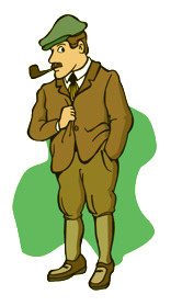
Clipart
But then there are so many elements that surround the main object of emphasis, which in this case is the pipe. Besides, again, the “cartoony” look, there are ridiculous, outmoded fashions (which may be OK if the design is striving for an antique/nostalgic look), plus there is an issue of colors that get introduced by the clipart (if your design scheme is using deep reds and yellows, say, this is going to look awful). And what’s with the guy’s facial expression? Yet most beginning designers will look no further than the pipe, and ruin their design because of it. Worse still, for this rhetorical situation (but certainly not for public health), there is the depiction of the health-hazardous act of smoking.
If the pipe is what’s important, then perhaps seek out something along these lines:

Pipe Clipart
Again, there is a palette at work here (although it’s natural to what we think of as pipe); but more importantly, there is a style: the rough lines, for example. While it's not cartoony, this pipe may not fit into a total design (see the Overall Design section below).
Why is clipart so difficult to work with? Because clipart is often stylized and colored, it may be hard to find some that really works well with your design, and manages to pull off the kind of ethos you’re striving for.
B. Illustrations and Diagrams
Like clipart, illustrations and diagrams can make or break a design. However, unlike clipart, which is meant usually as an accent, illustrations and diagrams often serve a central purpose to inform.
Always strive for clarity in illustrations and diagrams. Think about maps, for example. A driving atlas of the United States does not include representations and labels of every single office building, townhouse, apartment, gas station, and tool shed between New York City and Los Angeles. If it did, we’d have a hard time reading what we really want out of the map: the roads! Illustrations and diagrams are selective pictures of reality; that’s what makes them useful. In the case of representing large amounts of complex information, it is probably helpful to break up the information spatially—that's why driving atlases of the United States are in book form, and not gigantic maps; each state gets its own page, rather than the entire country squeezed onto a bedsheet-sized piece of paper.
C. Graphs
Programs like Microsoft Excel will automatically generate everything from bar graphs to pie charts; you can choose things like color and scale. Some issues to consider when choosing to graphically represent quantitative information:
- Everyone likes pie charts, but they are only helpful in terms of showing parts of a whole. So if your figures are not in percentages, pie charts won’t be of much help to you. And unless several pie charts are included, they are not useful for demonstrating changes over time.
- Bar graphs are especially helpful for comparisons between a number of different numeric variables, even over time.
- Line graphs are excellent for plotting changes in one variable over time, particularly over small time segments. When multiple colors are used, several variables can be plotted, but too many lines may be confusing, and a bar graph might be a better choice.
D. Photographs and Manipulated Images
With the availability of digital cameras, scanners, and other imaging devices coupled with the easy electronic distribution of photo-quality images, photographs are more popular than ever. Yet many beginning designers tend to avoid capturing their own images. Many will search the Web for images and, quality or not, copyright or not, will select the first available image. Again, we stumble onto the important question of ethos, which in the world of photographic images is primarily tied to two aspects of the photographic image: composition and quality.
We'll start with the second aspect, quality. Practically every computer image format has some settings for "compressing" the image. That is, areas of similar color lose their information, and are filled in with approximations when the image is opened in a Web browser or other program. Especially when designing for a Web audience, there is a constant push and pull between the quality of the image, and its size on disk. The better quality image, the larger it is on disk, and thus the longer it takes to load in a Web browser. However, in terms of ethos—and this itself is audience-dependent—it is often wise to opt for a slightly larger image file, rather than sacrifice quality.
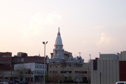
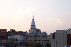
Consider these two photos of the Purdue Memorial Union:

Good Picture
Poor Picture
In both photos, the subject matter is clear; however, the quality is strikingly different. While the first photo still uses a fairly high compression, little details like the wisps of clouds and treetops are clear, as is the texture of the bricks and the panes in the windows. The second photo is clearly degraded—there are large blocks of blue visible in the sky area, and there are “sparkles” between the treetops and clouds, and the building and sky. Of course, the top photo file is three times larger than the bottom—but is the speed with which the second photo can be transferred worth the loss in quality? If this photo were in the context of a Web page meant to encourage students to come study at Purdue, which would likely have a more powerful effect on your impression of the University? Why?
In terms of composition, remember that photos are basically frames of reality. Any given subject can be photographed an infinite number of ways, both in terms of the framing (what is where in the shot) and the exposure (shutter speed, aperture, etc.) When shooting or selecting your images, pay careful attention to how the shot is composed. Is the image light? Dark? What gets highlighted? What is the central subject in the shot? What do you notice? Is there anything inappropriate in the shot that you wouldn’t want? Now, there are entire books and courses on photography, so we’ll have to limit our discussion to what has been said so far, with the exception of that last question: Is there anything inappropriate in the shot that you wouldn’t want? Digital photo manipulation has opened up huge possibilities for image manipulation. Consider the following two images:
Original Picture
Manipulated Picture
In the top image, various clutter (in this case, street lights) have been removed to improve the overall look of the Lafayette skyline. The question is this: what is the line between an accurate portrayal of reality, and an aesthetic representation of it? How is our ethos as visually-oriented writers affected, positively and negatively, when we manipulate images to achieve a certain effect?