Visual Rhetoric: Color

Welcome to the Purdue OWL
This page is brought to you by the OWL at Purdue University. When printing this page, you must include the entire legal notice.
Copyright ©1995-2018 by The Writing Lab & The OWL at Purdue and Purdue University. All rights reserved. This material may not be published, reproduced, broadcast, rewritten, or redistributed without permission. Use of this site constitutes acceptance of our terms and conditions of fair use.
There are thousands of books and Websites that cover the use of color from all sorts of practical and theoretical perspectives. We will limit ourselves here to some basic ideas about color. Please note that we are only scratching the surface by giving primary consideration to contrast.
Contrast is one of the most basic and critical choices for color. Basically, contrast deals with the brightness of one color relative to another—and contrast typically is pushed to its absolute envelope on the printed page. That's why black text on white paper is so common: the contrast between black character and white space increases legibility.
However, black on white is not the most interesting use of color. And when designing for the screen, white may not be the best choice—it can be almost blinding on certain monitors. One of the more conservative choices, then, is to run black text over a neutral, light color like beige or even mint green.
Many beginning designers, however, find themselves overwhelmed by the palettes available on most comptuers, and begin choosing colors for the palette of their designed based on favorites. However, results like that can be disastrous:
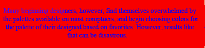
Blue on Red
Can you read that? Not comfortably! Imagine an entire screen of text like that. Part of the reason that this color combination (which appears more frequently on the Web than you can imagine) is so hard on the eyes has to do with how computer screens handle color information. If you move your face close enough to the screen, you'll notice an almost black outline at the left side of the characters, and a strange, almost white glow at the right. Why? Computer screens are made up of tiny little boxes of light, called pixels. Each pixel contains a red element, a green element, and a blue element (you can see this even better on a standard television set). But what happens in this case is the red element of the red areas of the screen is full on (leaving green and blue dark), and the blue element of the blue areas is full on (leaving red and green dark). The result is a literal "black hole" on the left side (remember, RED GREEN BLUE), and a glow on the right (since both the far-right BLUE element is full on, as is the far-left RED).
OK, enough technical information. But another problem with this palette is the fact that blue and red do not have much contrast from one another—they are roughly the same brightness. Worse than that, red is culturally-coded to jar us (just like the bulls at the Plaza de Toros). That's why red is typically used on everything from stop signs and stop lights to warning labels and fire alarms.
Gray on Yellow
Now, this is not an ideal palette—but it does illustrate our concern with contrast. This may not be a fun palette for reading several thousand pages of an online novel, but it's great for small areas of text and encouraging a soft, peaceful mood.
Black on Yellow
Part of what’s at issue with these colors—the black versus the grays, the muted versus bright yellows—is the idea of saturation. Saturation is how much of a color there is. You might think back to when you painted with watercolors as a child. If you really scrubbed your brush around in the yellow paint, you’d get a deep, bright yellow. But by watering the brush down, and dabbing just the tiniest bit of yellow, you got something of a more faint, muted yellow.
One of the common mistakes that beginning designers make is using highly-saturated colors (which is another reason the red-on-blue thing didn’t work above). Perhaps it's because we liked the brightest-colored crayons as children. However, you'll find that most sophisticated designs tend to use muted/desaturated colors.
Finally, the advice we’ll leave you with (besides "go pick up a few dozen books on color theory") is this: just like we have certain culturally-loaded sensibilities when it comes to font choices, the same is often true for color. Think, for example, about the difference in color schemes between a Best Buy ad (deep blues, bright yellows) and a Fall catalogue for J. Crew (deep wood-tones, crisp blue-grays). Each one conveys a level of excitement (or not), and a degree of sophistication. Observe the colors around you—see what they do, and what impacts they have on you. Bring those ideas with you as you design with color. And remember: it's no sin to borrow and experiment with a color scheme you find.
Color Summary: Questions to Consider
When Choosing Colors
- Does the combination of colors you’re using lend itself to easy reading, either on-screen or on paper?
- Are the cultural associations, if any, accompanying the colors appropriate?