Using Fonts with Purpose

Welcome to the Purdue OWL
This page is brought to you by the OWL at Purdue University. When printing this page, you must include the entire legal notice.
Copyright ©1995-2018 by The Writing Lab & The OWL at Purdue and Purdue University. All rights reserved. This material may not be published, reproduced, broadcast, rewritten, or redistributed without permission. Use of this site constitutes acceptance of our terms and conditions of fair use.
Does Type Font Matter?
It is easy to think that type font doesn’t matter. We read text all the time and have become very accustomed to focusing on the content or message of the words themselves and not what the words look like visually. In reality, the visual appearance of words themselves can (and should) have just as much effect on how a document is received as the content itself. Fonts can create mood and atmosphere. Fonts can give visual clues about the order a document should be read in and which parts are more important than others. Fonts can even be used to control how long it takes someone to read a document.
The professional printing industry has recognized this fact for a long time. Since the 1500s, they have used text called a “Lorem Ipsum” to demonstrate what a font will look like without having the reader become distracted by the meaning of the text itself. Although the term resembles ancient Latin, it is not actually intended to have meaning.
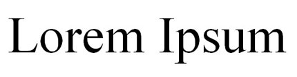
Times New Roman
Above is a font that is probably quite familiar to you - Times New Roman. Especially in academic circles, Times New Roman is so popular that you almost have to use a Lorem Ipsum to actually see the curves and spacing characteristics of the font itself.
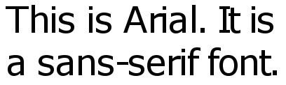
Arial
Here is another popular font called Arial. Looking at the Times New Roman and Arial fonts together it’s possible to see some subtle differences. Perhaps the choice to use Times versus Arial won’t make the most drastic of differences; however, there are so many different fonts to choose from that the point becomes much clearer once we move beyond more traditional choices.
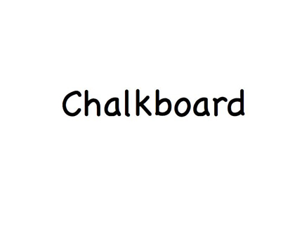
Chalkboard
Above is a lesser known font called Chalkboard. This font is so different that it shouldn’t be hard to realize that a page full of text in Chalkboard would look and feel very different from the more traditional Times or Arial.
Understanding how type fonts work involves learning some new terminology and thinking about the cultural codes behind words themselves. However, once you do so, font choice becomes another highly effective way to fuse your documents with additional meaning and rhetorical effectiveness.