Font Features

Welcome to the Purdue OWL
This page is brought to you by the OWL at Purdue University. When printing this page, you must include the entire legal notice.
Copyright ©1995-2018 by The Writing Lab & The OWL at Purdue and Purdue University. All rights reserved. This material may not be published, reproduced, broadcast, rewritten, or redistributed without permission. Use of this site constitutes acceptance of our terms and conditions of fair use.
Graphic designers have developed a large vocabulary of terms to discuss the makeup of a font. Fortunately, learning just a few of these terms will greatly aid you in making choices about how to use a font to communicate additional meaning beyond just the words themselves.
Font Types
1. Serif Fonts
One of the primary distinctions between font types is Serif fonts versus Sans-Serif fonts. Although the exact derivation of the word “serif” is unknown, it may be easier to grasp the concept if you think of them as feet. Since “sans” comes from the French for “with out” you can see fonts as having feet or being with out feet.

Georgia
Above, the circled sections highlight some of the serifs in the font type called Georgia. The serifs are little lines (or feet) at the end of particular line strokes.
Popular serif fonts include:
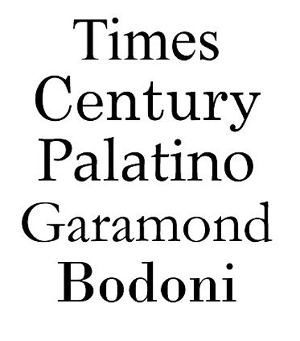
Popular Serif Fonts: Times, Century, Palatino, Garamond, and Bodoni
2. Sans-Serif Fonts
If serif-fonts have lines (or feet) at the end of particular strokes, then non-serif fonts are marked by the absence of these features.

Image Caption: Arial
Above is one of the most well known non-serif fonts. Notice how in comparison to the serif fonts, the line strokes end cleanly without any additional flair.
Popular Sans-Serif Fonts include:
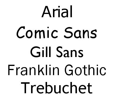
Popular Sans Serif fonts
3. Decorative Fonts
Sometimes called script, novelty, or ornamental, decorative fonts stand out for their unique shapes and personalities. These tend to have a stronger personality or character than traditional serif or sans-serif fonts.
Some examples of decorative fonts include:
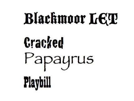
Decorative Fonts Blackmoore LET, Cracked, Papayrus, and Playbill
Tips
- Research has found that the difference in readability of serif vs. sans serif fonts is negligible in print sources. However, in electronic or virtual contexts, sans-serif is a little easier to read. Consider the rhetorical situation (purpose, audience, context of use) of your communication when you choose your fonts.
- Sans-serifs are most typically used for headings and titles. In this use, they provide a nice contrast with the serif font used for the extended text below them. Like all conventions, this advice may change based on your audience. For example, European countries seem to have a higher tolerance for sans-serif fonts in long blocks of text on paper.
- It’s a good rule to never mix two different types of the same font category. In other words, do not use a Times New Roman title over a text block of Palatino. Both are serif fonts and will not mix well. The ideal situation is to pair one serif font with one sans-serif font.
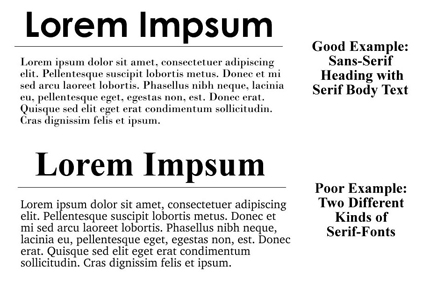
What to Do for Headings and Body Text
- Although there is no official rule, too many different fonts on one page can appear chaotic and distracting. Figure out what message you’re trying to convey and decide how to accomplish it with limited fonts.
- Use decorative fonts sparingly. Their unique features definitely make them unsuitable for extended reading. They work well for headers and titles or to add a bit of emphasis to a piece of text.
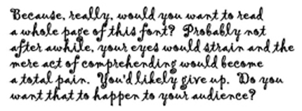
When Not to Use a Decorative Font
- When emailing or using fonts on the web, remember that not all computers will contain the same font sets as yours. Either use more popular fonts or set up alternate fonts in the page’s coding.