Font Personality

Welcome to the Purdue OWL
This page is brought to you by the OWL at Purdue University. When printing this page, you must include the entire legal notice.
Copyright ©1995-2018 by The Writing Lab & The OWL at Purdue and Purdue University. All rights reserved. This material may not be published, reproduced, broadcast, rewritten, or redistributed without permission. Use of this site constitutes acceptance of our terms and conditions of fair use.
Although fonts are often classified by the typographical features of serifs, they can also be described as having more human-like personalities. In other words, the appearance of the font (regardless of what the words say) gives off a certain mood and feel which can alter the effectiveness of your document. Learning to predict how your font choice might make your audience feel is another way to ensure your document achieves the effect you are going for. Although there is no firm equation (no Times New Roman always equals THIS specific mood), you have grown up in the culture where these personality associations have developed; therefore, much of the predicting may be based on awareness and instinct.
Let’s return to our Lorem Impsums, as to not become distracted by the meaning of the words.
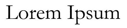
Garamond
Above is a serif-font named Garamond. As a serif-font, it is good for long blocks of text. Its smooth curves and simple serifs could be said to portray a classic and easy-going beauty. These tend to be good feelings for long blocks of texts; therefore, Garamond can be an effective, rhetorical choice.

Franklin Gothic
Above is the sans-serif font Franklin Gothic at a large size and at a much smaller size. We could say it’s a fairly straightforward font. Its features are not very distracting. We can also see that it maintains a high level of readability even when printed small. Once you know that this is a popular font choice for newspapers, you can see how it could be chosen to capitalize on these exact features.
Beyond serifs and sans-serifs, the appearance of decorative fonts have the most potential to tap into cultural associations. Although the Lorem Ipsum is useful to look at a font’s, basic characteristics without word meaning, in practice, the meaning of the words are effected by the font they are displayed in. Because of this fact, great care should be taken to match the font’s personality with the sentiment and purposes of your document (especially when using the more decorative options).
For example, look at these two possibilities for the heading of a greeting card:
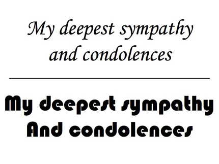
Monotype Corsiva vs Bauhaus 93
The top example is in Monotype Corsiva. This is a font that mimics the effect of handwritten text and reflects the heartfelt sentiment of the statement and card’s purpose. On the other hand, the bottom example is displayed in a font called Bauhaus 93. Bauhaus 93 (as the name suggests) is a cold, Modernist looking font perhaps best associated with fliers for graphic design shows. This coldness is not appropriate for a greeting card expressing condolences and is therefore a poor rhetorical choice. This does not mean Bauhaus 93 is a poor font all around. For example, it might be completely appropriate for something like this:
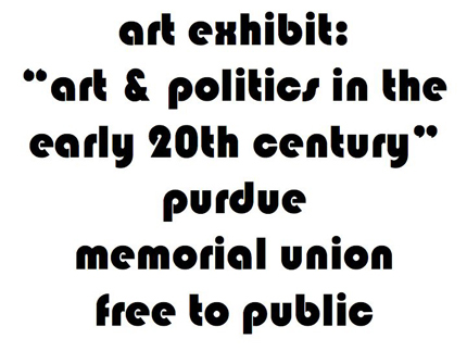
Rhetorically Appropriate Use of Bauhaus 93
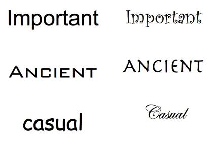
Matching font personality with the tone of the piece is sometimes subjective and certainly not an exact science. A good technique to see if you’re choosing appropriate fonts is to use a font that seems completely opposite of what you’re trying to convey. Seeing how “wrong” this can look might help you pick a more appropriate font. Below there are two columns of words. Column A tries to set an appropriate mood for the feeling suggested by the word. Column B tries to achieve the opposite feeling. Do you think the columns are successful?
Fonts Should Match their Rhetorical Situation