APA Tables and Figures 2

Welcome to the Purdue OWL
This page is brought to you by the OWL at Purdue University. When printing this page, you must include the entire legal notice.
Copyright ©1995-2018 by The Writing Lab & The OWL at Purdue and Purdue University. All rights reserved. This material may not be published, reproduced, broadcast, rewritten, or redistributed without permission. Use of this site constitutes acceptance of our terms and conditions of fair use.
Note: This page reflects APA 6, which is now out of date. It will remain online until 2021, but will not be updated. The equivalent APA 7 page can be found here.
Figures
Figure Checklist (Taken from the Publication Manual of the American Psychological Association, 6th ed., Section 5.30)
- Is the figure necessary?
- Is the figure simple, clean, and free of extraneous detail?
- Is the figure title descriptive of the content of the figure?
- Are all elements of the figure clearly labeled?
- Are the magnitude, scale, and direction of grid elements clearly labeled?
- Are parallel figures or equally important figures prepared according to the same scale?
- Are the figures numbered consecutively with Arabic numerals?
- Are all figures mentioned in the text?
- Has written permission for print and electronic reuse been obtained? Is proper credit given in the figure caption?
- Have all substantive modifications to photographic images been disclosed?
- Are the figures being submitted in a file format acceptable to the publisher?
- Have the files been produced at a sufficiently high resolution to allow for accurate reproduction?
As tables supplement the text, so should each figure.
Types of Figures
Graphs are good at quickly conveying relationships like comparison and distribution. The most common forms of graphs are scatter plots, line graphs, bar graphs, pictorial graphs, and pie graphs. For more details and specifics on what kind of information, relations, and meaning can be expressed with the different types of graphs, consult your textbook on quantitative analysis. Spreadsheet programs, such as Microsoft Excel, can generate the graphs for you.
Scatter plots are composed of individual dots that represent the value of a specific event on the scale established by the two variables plotted on the x- and y-axes. When the dots cluster together, a correlation is implied. On the other hand, when the dots are scattered randomly, no correlation is seen.
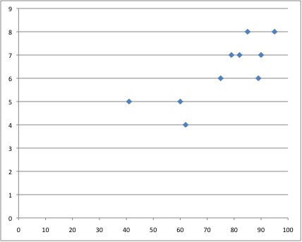
Figure 1. Example of a Scatter Plot Graph. This figure demonstrates a proper scatter plot graph.
Line graphs depict the relationship between quantitative variables. Usually, the independent variable is plotted along the x-axis (horizontally) and the dependent variable is plotted along the y-axis (vertically).
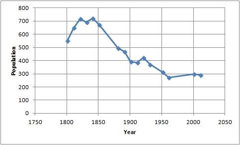
Figure 2. Example of a Line Graph. This figure demonstrates a proper line graph.
Bar graphs come in three main types: 1) solid vertical or horizontal bars, 2) multiple bar graphs, and 3) sliding bars. In solid bar graphs, the independent variable is categorical, and each bar represents one kind of datum, e. g. a bar graph of monthly expenditures. A multiple bar graph can show more complex information than a simple bar graph, e. g. monthly expenditures divided into categories (housing, food, transportation, etc.). In sliding bar graphs, the bars are divided by a horizontal line which serves as the baseline, enabling the representation of data above and below a specific reference point, e. g. high and low temperatures v. average temperature.
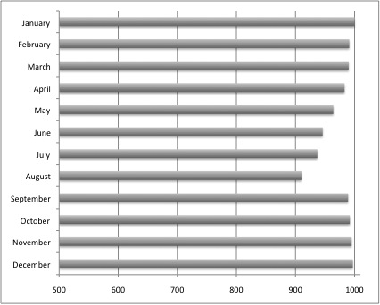
Figure 3. Example of a Bar Graph 1. This figure shows an example of a bar graph.
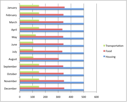
Figure 4. Example of a Bar Graph 2. This figure shows a second example of a bar graph.
Pictorial graphs can be used to show quantitative differences between groups. Pictorial graphs can be very deceptive: if the height of an image is doubled, its area is quadrupled. Therefore, great care should be taken that images representing the same values must be the same size.
Circle (pie) graphs are used to represent percentages and proportions. For the sake of readability, no more than five variables should be compared in a single pie graph. The segments should be ordered very strictly: beginning at twelve o’clock, order them from the largest to the smallest, and shade the segments from dark to light (i.e., the largest segment should be the darkest). Lines and dots can be used for shading in black and white documents.
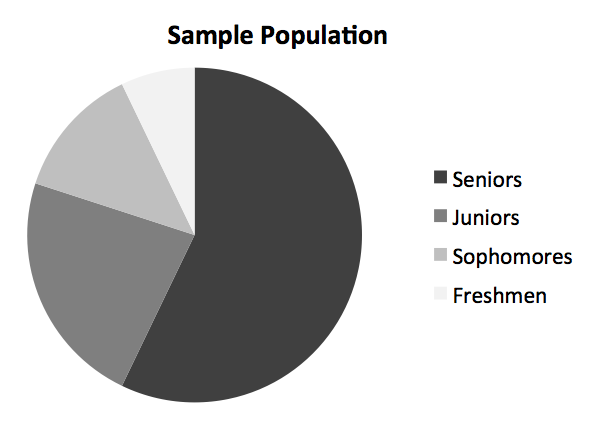
Figure 5. Example of a Circle (or Pie) Graph. This figure shows an example of a circle (pie) graph.
Charts are used to represent the components of larger objects or groups (e. g. military ranks), the steps in a process (as in a flow-chart), or the schematics of an object (the components of a cell phone).
Figure 6. Example of a Chart. This figure shows a chart.
Drawings and photographs can be used to communicate very specific information about a subject. Thanks to software, both are now highly manipulable. For the sake of readability and simplicity, line drawings should be used, and photographs should have the highest possible contrast between the background and focal point. Cropping, cutting out extraneous detail, can be very beneficial for a photograph. Use software like GraphicConverter or Photoshop to convert color photographs to black and white before printing on a laser printer. Otherwise most printers will produce an image with poor contrast.

Figure 7. Example of a Photograph. This figure shows an example of a photograph.
Preparing Figures
In preparing figures, communication and readability must be the ultimate criteria. Avoid the temptation to use the special effects available in most advanced software packages. While three-dimensional effects, shading, and layered text may look interesting to the author, overuse, inconsistent use, and misuse may distort the data, and distract or even annoy readers. Design properly done is inconspicuous, almost invisible, because it supports communication. Design improperly, or amateurishly, done draws the reader’s attention from the data, and makes him or her question the author’s credibility.
The APA has determined specifications for the size of figures and the fonts used in them. Figures of one column must be between 2 and 3.25 inches wide (5 to 8.45 cm). Two-column figures must be between 4.25 and 6.875 inches wide (10.6 to 17.5 cm). The height of figures should not exceed the top and bottom margins. The text in a figure should be in a san serif font (such as Helvetica, Arial, or Futura). The font size must be between eight and fourteen point. Use circles and squares to distinguish curves on a line graph (at the same font size as the other labels). (See examples above.)
Captions and Legends
For figures, make sure to include the figure number and a title with a legend and caption. These elements appear below the visual display. For the figure number, type Figure X. Then type the title of the figure in sentence case. Follow the title with a legend that explains the symbols in the figure and a caption that explains the figure:
Captions serve as a brief, but complete, explanation and as a title. For example, “Figure 4. Population” is insufficient, whereas “Figure 4. Population of Grand Rapids, MI by race (1980)” is better. If the figure has a title in the image, crop it.
Additionally, if the image is reproduced from another source, include the citation at the end of the caption.
Graphs should always include a legend that explains the symbols, abbreviations, and terminology used in the figure. These terms must be consistent with those used in the text and in other figures. The lettering in the legend should be of the same type and size as that used in the figure.